Trackbox
Filters & Board views
B2B Desktop App
In 2022, Trackbox introduced a new brand for the iGaming industry—a new platform to manage all your affiliate traffic.
A decision was made to align Trackbox's system with the new gaming industry design, adjusting existing features, improving infrastructure, and updating features to match the new technology.
Services
UX/UI
Web Platform Mobile
Brand Identity
Web design
INDUSTRIES
Ad-tech
i-Gaming
Smart Data. Smarter Decisions.
The ability to query and manipulate data is one of the key functionality for the majority of enterprise products.
Filtering helps users to find valuable information in the large chunks of data tables.
At Trackbox, Our product is characterized by a lot of tabular data, so a comprehensive filter is required to allow the user to filter their needs in the best possible way
Inefficient Filtering Process
The filter requires numerous clicks to find the optimal result. This making the process slow and overwhelming, especially with over 10 fields.
Limited Screen Space
The filter row takes up too much space, cluttering the interface and reducing viewable content.
Lack of Real-Time Parameter Feedback
Users cannot see the filter parameters immediately, only the number of selected parameters. This lack of instant feedback makes it difficult for users to assess and refine their choices effectively.
Inability to Compare Similar Data
The filter setup doesn’t allow easy comparison of similar data with one differing value.
From Insight to Interface

The goal is to simplify the filter process, making it FASTER and CUSTOMIZABLE.
Improve Filter Efficiency and User Control
Redesign the filter interface to be visually intuitive, user-friendly, and well-organized, emphasizing key filtering option
Enhance Usability and Visual Design
Simplify the filtering process by minimizing clicks
and allowing users to create and save custom filter preferences.
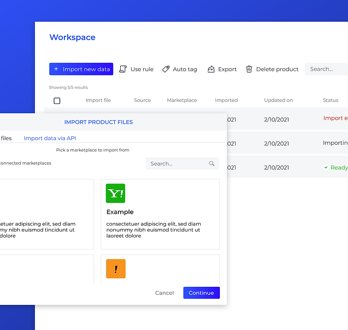
Market Research

As part of the research, I have analyzed similar platforms to see how they handle filtering
![lisuto matirials [Recovered]_trackbox 1 copy.png](https://static.wixstatic.com/media/6ba1c2_40c44830f1fc48edbdcb13d281b23720~mv2.png/v1/fill/w_980,h_980,al_c,q_90,usm_0.66_1.00_0.01,enc_avif,quality_auto/lisuto%20matirials%20%5BRecovered%5D_trackbox%201%20copy.png)
I also have studied about the competitors.
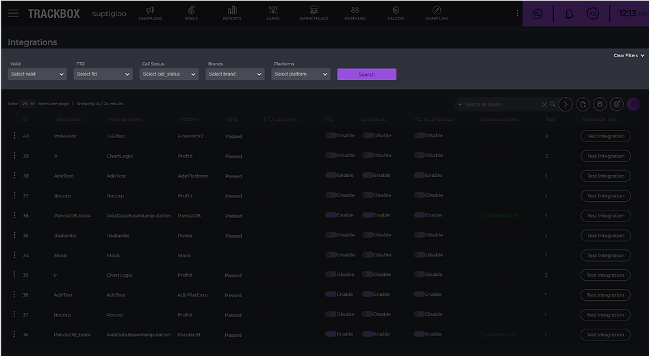
Before the Transformation
Smart Process, Real Results
We created a focus group of 6-8 users and conducted preliminary research on how the filter is used by the users.
Here are the main results:

The main conclusion was that the filter is used on a daily basis.

There was a demand to display the search results.

There was a requirement was the ability to save workspaces and filter templates.

Some users felt the search bar took up too much screen space and preferred more table rows to be displayed instead
As part of the work process, the first step was to address the filter.
We examined competitors and their methods of filtering information, as well as looking at complex information systems to see how they made filters accessible in their platforms.
The main goal was to ensure that existing users, who are already familiar with the system, could easily adapt to the new design changes the system allows.
From Insight to Interface
Filter out the noise, and let the good results shine!
1.

We collapsed the filter into a single button so that it wouldn’t take up additional space on the screen, preserving essential information.


2.

The filter opens in a floating modal on the screen to provide a quick and easy search experience.
Additionally, We added the option to pin the filter for users who prefer the filter to remain accessible and open, in order to avoid an aggressive transition from the old to the new design.

3.

We added a refresh button outside the filter, allowing the user to refresh data in real time with the existing search filters applied

4.
We reduced the number of clicks by making all filter content accessible and open by default.
Also, we maintained the functionality of the previous filter: displaying the filter count and showing the number of options, while providing dedicated space for search accessibility.

THE BOARD VIEWS
Save your workspace, save your energy!

Pinned filter
To enhance user efficiency and provide greater control over their workspace, I introduced a persistent filter panel with advanced customization options. Users can pin the filter panel at any stage of their workflow, ensuring it remains visible and accessible as they navigate the platform. In addition, they can adjust the panel's height to suit their personal preferences, allowing for a more comfortable and uncluttered interface.
This flexibility supports different usage habits and screen sizes, improving overall usability and focus. Whether a user prefers having filters always at hand or minimizing their presence to focus on results, the design accommodates both. The result is a more intuitive and adaptable experience, empowering users to tailor the interface to their specific needs.

Collapsed filter
Flexible Filter Panel –
Pin It, Resize It, Own It
As an equally important part of the filter specification task, we needed to handle the request to save the working environment.
What does this actually mean?
The board views allow to saving the working space of the user. This is very important action to our users.
Essentially, the user will be able to:

Visualize your board's information order

Fixed column layout, and table appearance

Create a permanent filter
The significant advantage that adds value to this feature is the ability to compare, for example, between campaigns, affiliates, and anything else that is possible.
The challenge was to add a feature that would be present throughout the system but without taking up much attention or space – visible but invisible.
We aimed to add the feature without cluttering the screen or taking up too much space. Since it's optional, it should not be visually intrusive, so a neutral color scheme was chosen.
1.
The ability to add a new board should be quick and efficient.
The browsing capability provides the ability to compare different information.
By clicking the "+" icon, a new user space is automatically created.
2.

For each page the user creates, we've enabled easy editing.
The two essential actions are: changing the name to differentiate pages, and copying (to replicate the filter and modify just one detail).
3.
This feature make the tool more user-friendly, efficient, and adaptable to the needs of users, leading to a smoother and more effective experience, which ultimately contributes to its success.