Trackbox
Reimagining the Main Menu: Simpler. Faster. Better
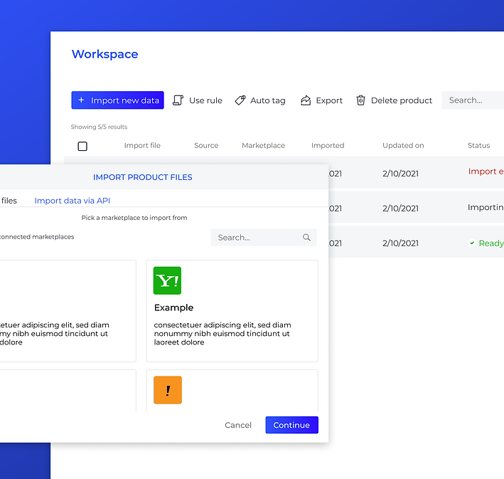
B2B Desktop App
Trackbox is a marketing performance-enhancing platform that enables businesses to generate additional revenue.
Trackbox allows users to scale and customize the platform to meet their unique business needs.
Its goal is to simplify and optimize the user workflow, helping businesses capture traffic for any marketplace. User-friendly and business-friendly,
Services
UX/UI
Web Platform Mobile
Brand Identity
Web design
INDUSTRIES
Finance
i-Gaming
Making Navigation Work for the User
Trackbox is a B2B platform designed to assist both the affiliate managers and the traffic providers. The system allows following user movement, while keeping in check all relevant data elements.
TrackBox was originally developed over the years by a team of developers, without any involvement from UX/UI professionals. As the platform evolved, many new features were added to support advanced tracking and user management.
However, the top navigation remained static and inflexible—users couldn’t customize it, even if some of the features included were irrelevant to their daily workflows.
As more capabilities were added, all new features were placed inside a single dropdown menu, divided into categories that didn’t necessarily align with real-world user behavior. This led to cognitive overload, confusion, and inefficiencies in everyday use of the system.
Turning Navigation into a User-Centric Experience
The project emerged from a clear need: to make the main menu more usable and user-centered. The main goal was to allow each user to build a personalized navigation menu with shortcuts to the features they use most frequently.
This approach aimed to transform the system into a more flexible, focused, and tailored experience—boosting both efficiency and the user’s sense of control.
Additionally, the project aimed to redesign and restructure the navigation bar and the user toolbar to enhance clarity and accessibility. It focused on eliminating unnecessary elements, highlighting the most relevant daily tools, and promoting premium features to support business goals and generate additional revenue opportunities.

Unclear Structure
The growing list of features was grouped into categories that didn’t reflect actual user workflows, creating confusion and inefficiency.

Lack of Personalization
Users couldn’t customize the navigation bar, resulting in irrelevant or unused features cluttering their interface.

Non-Responsive Design
The static menu wasn’t optimized for mobile or tablet use, limiting accessibility across key devices.

Before the Transformation
Overview
Trackbox is a B2B platform designed to assist both the affiliate managers and the traffic providers. The system allows following user movement, while keeping in check all relevant data elements.
Pain Points
1. The system was developed by developers, missing key elements of user experience as well as missing out on ideas of promoting premium features.
2. The result was that the users could not make out the most out of the dashboard, and user acquisitions weren’t optimized.
3. There were indications of ineffectiveness. Our support desk raised recurring cases of users unable to locate certain features.
4. The order of the bar confused users. The old navigation bar included system pages, user page, notifications, clock and a horizontal menu, which were all disorganized. There was an urgent need to make the system accessible, so that onboarding users would be able to maximize their use of the system.
5. Existing and new users alike needed better functionality that the previous bar missed.
6. The system wasn’t responsive for devices, missing out on key channels for the users to handle and control.
Objective
The project aimed to redesign and restructure the navigation bar and the user toolbar. The aim was to give added clarity, accessibility, remove inessential features and promote premium features to generate additional revenues.
market research
After identifying the core problem and pain points within the existing navigation structure, our first step was to explore how other platforms—both direct competitors and systems in adjacent industries—address similar challenges.
We focused on analyzing how complex, feature-rich systems deliver accessible and flexible navigation experiences to end users. This phase allowed us to gather valuable insights and best practices around menu hierarchy, customization, and adaptive design—serving as a foundation for ideating the new, user-centric navigation model for our system.
Systems in adjacent industries
![lisuto matirials [Recovered]_trackbox 1.png](https://static.wixstatic.com/media/6ba1c2_dc1cbede99f04d779212b9ad72c26a45~mv2.png/v1/fill/w_980,h_980,al_c,q_90,usm_0.66_1.00_0.01,enc_avif,quality_auto/lisuto%20matirials%20%5BRecovered%5D_trackbox%201.png)
Direct competitors of the company
![lisuto matirials [Recovered]_trackbox 1 copy.png](https://static.wixstatic.com/media/6ba1c2_40c44830f1fc48edbdcb13d281b23720~mv2.png/v1/fill/w_980,h_980,al_c,q_90,usm_0.66_1.00_0.01,enc_avif,quality_auto/lisuto%20matirials%20%5BRecovered%5D_trackbox%201%20copy.png)

Strategic Design Decisions: Balancing Change with Familiarity
The redesign was guided by three key objectives:
-
Retain existing users by maintaining familiarity and preventing frustration or churn due to drastic interface changes.
-
Highlight and promote premium features in order to encourage users to upgrade their plans—supporting both user growth and business goals.
-
Reduce visual noise by minimizing the presence of rarely-used features and prioritizing essential daily tools.
To support these goals, we decided to keep a top navigation bar as a central structure—leveraging its ability to display information in a clear, wide format across the screen.
This bar includes the most frequently used features for each user, ensuring quick access without overwhelming the interface.
Additionally, the expanded dropdown menu was reorganized into three clearly defined sections. This new structure aimed to bring logic and clarity to the user experience, making navigation faster, more intuitive, and easier to learn.
Premium features were marked by using an icon system instead of the previous list,


Additional features were listed right next to premium feature icon system and mapped by categories,


User interaction. To promote user interaction, a personalized user area was added, allowing creating action items in a click.
The clock was repositioned and emphasized visually, as well as a brand new updates box.

The initial survey conducted with our focus group generated a largely negative response from users, revealing key usability concerns that required immediate attention.
-
Clock Repositioning: The repositioning of the clock—one of the most frequently used elements—was not well received.
Users struggled to adapt and expressed frustration over its new location.
-
Missing Icon Labels: Removing icon labels to achieve a cleaner interface backfired, creating confusion and slowing down task completion due to lack of clarity.
-
Personalized Box: The introduction of a customizable quick-access box did not perform as expected.
It received minimal engagement and was perceived as irrelevant by most users.
-
Premium Features: Paid features were given significant space and visual weight within the interface. However, instead of encouraging upgrades or increased usage, this approach caused distraction and visual overload—especially as these features took up more space than the essential, day-to-day tools users actually needed.
These insights highlighted the importance of preserving familiar touchpoints and underscored the need for clarity, context, and evidence-based design choices when introducing change.
What We Changed & Why
At this point, we decided to take on a bigger, full-scale process of injecting new, advanced functionality to the system instead. Keeping the system simple, accessible and clear. While we wanted to add additional features to make sure state-of-the-art technology is given its proper volume, the intention was to make sure the users are able to use it.
A new mapping process followed keeping these ideas in mind. The intention was to make a distinction between the user account and the user action items.

1. New concept
The new concept was to distinguish clearly between the user settings and the "shortcut" pages.
We have reverted the top bar, placing the clock back on top, as well as reinserting the names of the icons.
Left side: The menu icon (hamburger) was aligned to the left, to catch the eye for global users.
We placed the pages that the user uses the most based on the research we conducted.
The horizontal bar line was removed, and the features were reorganized under the menu bar.
Right side: Included the clock, notifications, and search system bar) and the menu bar, which included the action features.


Left side
Right side

2. Grid/List menu
To improve user experience and provide more flexibility, the user was allowed to choose between icon grid and list.
A search bar for the menu itself was added, allowing to quickly navigate through features.


Search bar
List view
Grid view
3. Premium features
Premium features were clearly labeled and grouped to improve transparency and guide user attention.
On hover, a contextual pop-up was introduced—providing a short explanation about the feature along with quick actions such as upgrading the plan or contacting the support team directly.


4. Customizability
• Action items can now be dragged to the top icon bar, providing users with a personalized, customizable menu option
• The top bar was now much more user-friendly and allowed enhanced user control.

Drag
Customized menu
Customized top menu
5. Management Features Separation
All system and permission management tools were grouped into a dedicated side menu section.
This structural change was made to clearly distinguish between platform administration and campaign management, reducing user confusion and improving navigation clarity.
Additionally, the display of notifications and alerts was moved to a separate, dedicated area—visually and functionally separating them from the main navigation bar.

6. Responsiveness
The system now is responsive for devices


Success Metrics
The project was very successful, and the clients were highly satisfied.
The transition for users was smooth and seamless.
1. User Satisfaction
Positive feedback and high satisfaction ratings from clients
2. Adoption Rate
-
High amount of users actively using the new features (e.g., drag-and-drop functionality, customizable menu options).
-
High adoption rate of the new dynamic interface and premium features.
3. Customization Usage:
High amount of users customizing their menus, indicating the value and effectiveness of personalization options.