Lisuto
Design System
B2C Desktop App
Lisuto AI is a technology company that focuses on optimizing site navigation experiences, particularly for eCommerce marketplaces and sellers.
Lisuto AI allows marketplaces and sellers to leverage their data, drive more traffic and maximize sales while minimizing manual efforts.
Services
UX/UI
INDUSTRIES
e-Commerce
Spotting the Struggles
I inherited an outdated system that had been designed and developed solely by engineers, without any involvement of UX professionals or a user research process. The interface was outdated and the functionality limited. Users struggled to perform even basic tasks, and the design failed to meet the cultural and visual expectations of the Japanese market—the product’s primary audience.
I led a comprehensive process of research, UX planning, and redesign, created a new design concept based on principles of simplicity, clarity, and cultural relevance.
The improvements went far beyond visual changes—they significantly enhanced the user experience: streamlining complex flows, improving accessibility, and creating a deeper understanding of user needs.
Those are the 4 main pain points:
Not user-friendly
The user experience is not optimized for ease of use or efficiency.

Limited Features
The system had very few features compared to competitors, which limited the users' business capabilities.

Market Fit
Needed updates to meet the specific demands of the Japanese market.

Outdated Design
Built using old templates, making the system feel outdated.
Building a design system

The goal is to provide a modern, user-friendly platform
tailored to the Japanese market
Redesign User Interface
Redesign UI with modern, responsive design for better and easy user experience.
Simplify the User Experience
Improve user experience through simplified navigation and usability testing.
Previous Screens


From Outdated to Outstanding
The new design and process were divided into several steps and were based, of course, on a clean and simple design.
Grid & layout: I established a clear and flexible grid system with well-defined rules, allowing for both structure and design freedom. The grid system maintains a consistent layout and responsive sizing.
Color: Lisuto had 2 main colors (blue and yellow), and we added other colors that will accompany us throughout the entire system.
The new color theme help maintain consistent use of color throughout the design system.
Typography: I defined a new set of solid text styles and created clear guidelines for their usage in different contexts. Same as the color tokens, the typography tokens are used to maintain a consistent set of font styles throughout the design system.
Iconography: A new icon library was created to unify the appearance of all icons across Lisuto's products.
As part of the design research process, the client requested to adapt the system to the existing web branding, with an emphasis on clean and simple design.While researching, I explored and analyzed marketplace web applications while also researching and studying applications for data input, insight generation, and SaaS platforms.


The new design system included:
style, components, UX patterns, accessibility.
First Step: System Layout
Good layout helps the viewer understand the message the design is conveying!
We began by defining the product's layout and needs (pinpointing the key values and actions most relevant to our users).
So, we took the main and most important screen as an example and built the layout based on it.
Menu
As part of the different sketch proposals, there were different suggestions for the menu placement.
One option was horizontal navigation (top-aligned), which provided accessibility and full-screen interaction, but it had its own disadvantage (After all, not every screen is wide today). So, we decided to keep the menu on the left side of the screen.
We created a new icon language that fits the new design.
Also, we grouped pages with the same topic into categories for better organization and clarity.
Table
The requirements, as a result of the product's development and product demands, is the ability to present information in an organized and readable table. Therefore, an integral part of the layout is a tabular section where we will centralize all the important information for the client, whether it's through scanning files or displaying different information.
Buttons & Actions
Centralizing key actions in one area is a design strategy that aims to streamline user interaction and improve usability.
By grouping essential functions, users can quickly locate and access them without unnecessary effort or distractions.
Since the data table becomes highly functional as part of the system's requirements, many actions are performed on it, and therefore, they are prioritized above the table.
Additional actions
System actions (such as user details, notifications, and plan upgrades) are placed in the top-right corner of the screen.
This location was chosen to be far enough from the table actions to avoid confusing the user.
These actions are now simplified to icons.

![table [Recovered]-08 1.png](https://static.wixstatic.com/media/6ba1c2_552b241703324c2aa641da183804f820~mv2.png/v1/fill/w_980,h_551,al_c,q_90,usm_0.66_1.00_0.01,enc_avif,quality_auto/table%20%5BRecovered%5D-08%201.png)
Second step: Define the new table
A good table allows you to sort and digest information easily and intuitive.
We made the information clear, accessible, and actionable, and helping users to quickly compare and make purchasing decisions.
We added quick actions to each row in the table, so the user can easily edit directly from that row.
Quick actions
Visual elements are added to enhance readability and highlight the most important information in a clear and easy-to-read way.
Visual Appeal
Adding additional actions to the columns will provide the user with an easy way to filter and add directly from the table.
Buttons

IDENTITY BRAND
Blue
#3052FC
Light Blue
#e3e7f9
red
#c91D12
YELLOW
#FFC226
Light gray
#F5F6F8
207/50/79
GREEN
#17AF10
ORANGE
#FF7124
PINK
#C71C9A
tIll
#00BCB7
Dark purple
#7B1D8D


ICONS
Composite components (Floating/Pop-up modalS)
DESIGN SCREENS
Dashboard

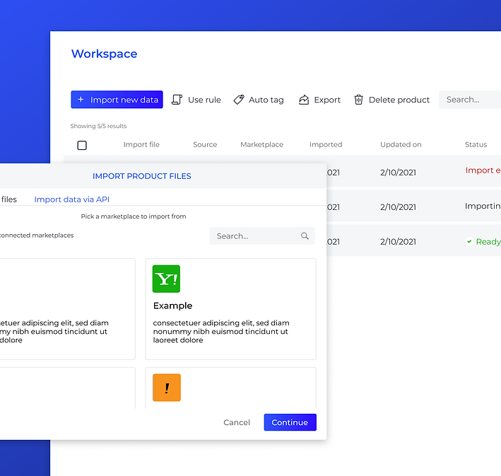
Workspace page
In this page the user uploads his products and tags them

Internal page (edit list & products)

Notifications

Change plan
For Lisuto, it's essential for monetization, and for users, it ensures they are not dependent on a third party and gives users the freedom to tailor the system to specific requirements without needing a complete overhaul or new setup.


Import Variation feature
Variations feature lets the user easily create his options directly from one product page.

Create Campaign
This screen enables the creation and tracking of smart campaigns. It integrates product filtering and keyword-based product placement to optimize the campaign, maximizing the seller's revenues.